Sponsorship dashboard
A measurement dashboard built once as a Core, then shipped to Amex, SARU and Animal Friends as config plus a re-skin. The asset is the platform, not the dashboard.
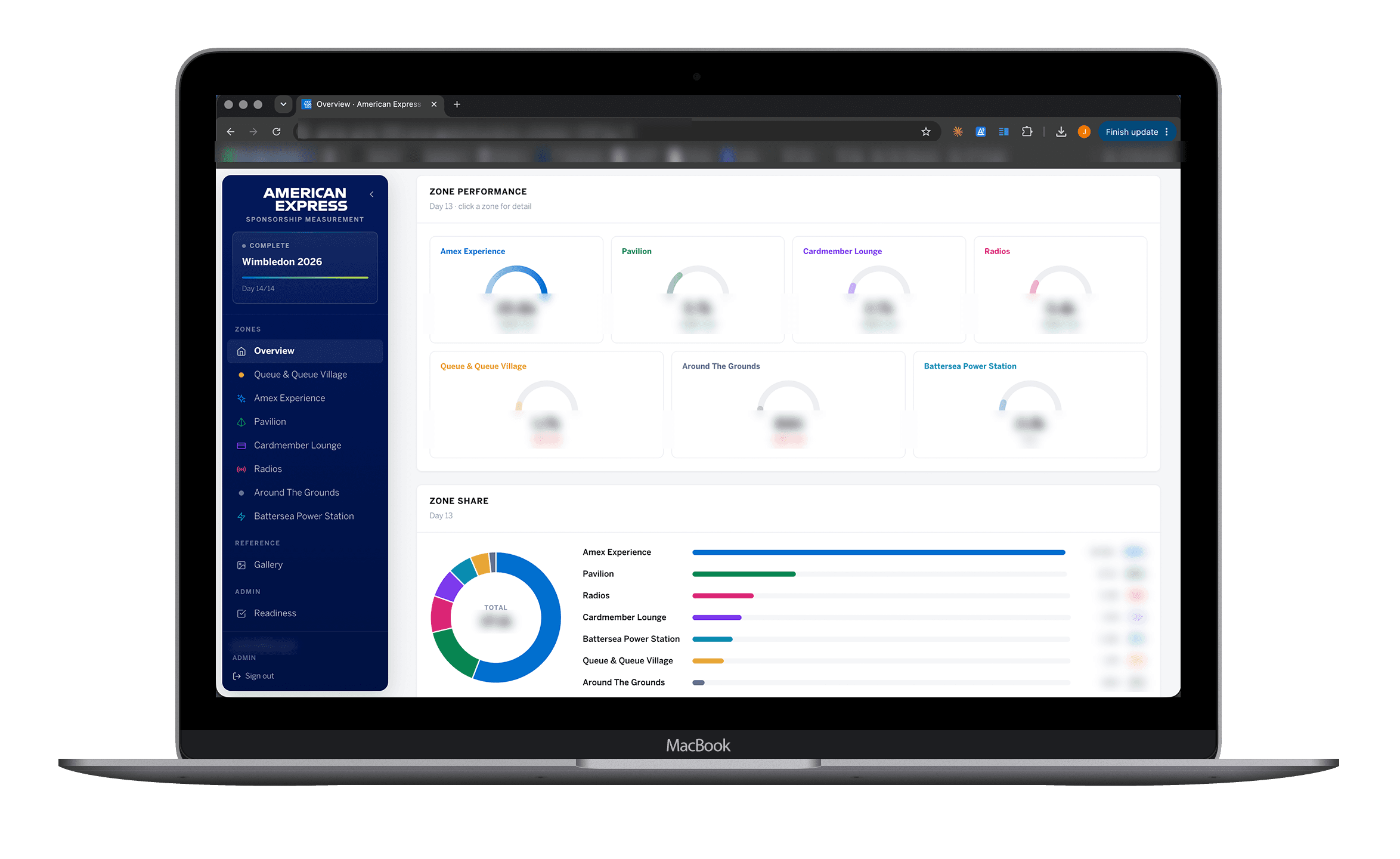
Zone performance. Seven activation zones, year on year movement, share of total
Outcome
Live for Amex x Wimbledon 2026, then reused for SARU x Vodacom and Animal Friends off the same Core. A new client is config and brand, not a rebuild. The Core is now a capitalised THE·TEAM asset. React, TypeScript, Tailwind, Supabase, Vercel, EU-hosted.
3+ clients
One shared Core
68
Touchpoints live (Amex)
Daily
Sheet to Supabase sync
Core/Config/Skin
Reuse model
Design decisions
Metrics are data, not screens
Each client measures something different, so the easy version is bespoke screens per client. I pushed the difference into a metric registry: a metric declares what it is, how it formats and how it compares year on year, and the interface renders whatever the registry holds. A new client metric is a config entry, not a design and build cycle.
Two audiences, two surfaces
The client wants a clean read of the activation. The agency needs to trigger syncs, author insight and manage access. One screen with permissions hiding the difference would have compromised both, so I split them into a viewer dashboard and an admin console, and kept the viewer free of anything operational.
Show the data's age, do not fake live
Numbers arrive on a daily end-of-day sync, not in real time. A dashboard that looks live but is not destroys trust the first time a client checks a figure against their own. The interface states when the data last synced, so a day-old number reads as expected rather than broken.
Zones first, touchpoints on demand
Sixty-eight touchpoints on one screen is a spreadsheet, not a dashboard. The activation's own structure gave the hierarchy: seven zones as the headline read with year-on-year movement, touchpoint-level detail one level down. Clients get the answer on the overview and the evidence when they want to interrogate it.
That hierarchy, in use
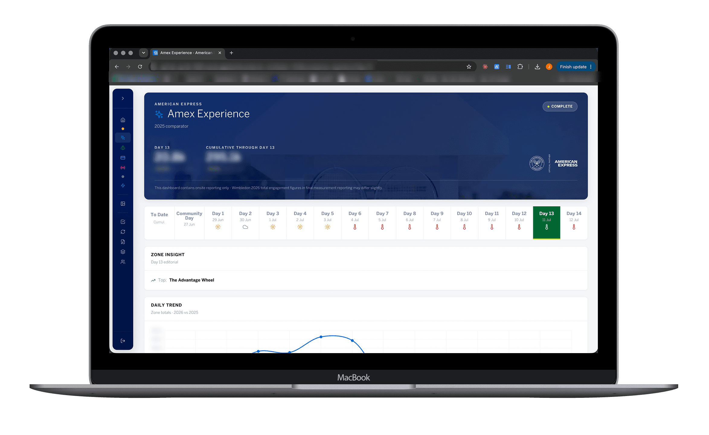
Seven zones carry the headline read, each with its own year on year movement. One click opens a zone and only then does its trend, editorial and touchpoint detail appear. Client figures are redacted here, the structure is what matters.
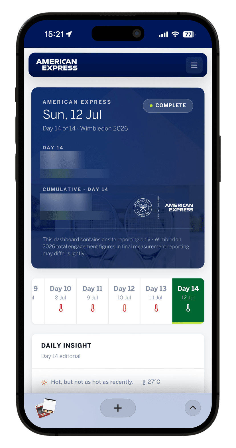
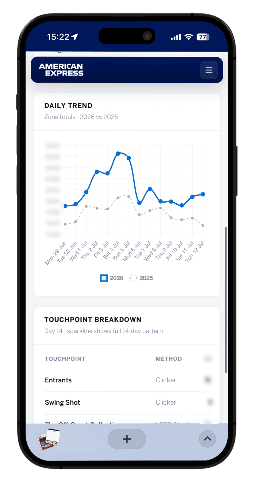
The same dashboard on a phone
Clients read this on the way to a meeting, not at a desk. The day selector scrolls rather than compressing to fit, and the touchpoint table reflows to two columns with the value pinned right.
Process
Three layers. Core is the shared engine (app shell, Supabase data layer, auth, charts, role-based access, sync pipeline), built once and never rebuilt. Config is each client's metrics held as data in a registry. Skin is their brand as tokens. A new deployment is Config and Skin only. Amex x Wimbledon 2026 went first: 7 activation zones, 68 touchpoints, a daily Google Sheet to Supabase sync the agency triggers at end of day, year on year movement computed in the parser, a viewer dashboard, an admin console and an image gallery. Each client gets its own database and hosting, fully white-labelled. Typecheck blocks every deploy and the sheet parser is covered by tests. Porting the frontend for the second client, two agents in a multi-agent workflow no-opped and reported success. I caught it by running the checks myself and reading the repo, then rebuilt the sync layer by hand. Anything calc-driven now gets a logic harness and a scripted browser pass before a client sees it.
Context
Every sponsorship client wanted their activation data as a live branded dashboard. Building each one from scratch meant a fresh project, fresh cost and fresh bugs. I wanted the engine built once, with a new client being config and brand rather than new code.